
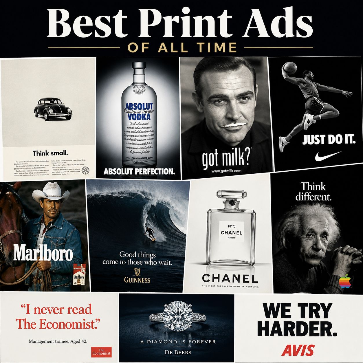
Print ads have a way of stopping you mid-page-flip in a way a skippable video never can. Long before “going viral” meant a video, the best print ads and magazine ads were already being clipped out, pinned to fridges, and passed around offices. This roundup pulls together some of the most celebrated print advertisements and best print ad campaigns ever made — funny ones, tearjerkers, technically brilliant ones, and a few that are simply one perfect idea on a single page.
Whether you’re after inspiration for your next campaign, a study of what made these best print ad campaigns work, or just want to lose an afternoon admiring great copywriting and art direction, this list is organized into easy-to-browse categories below.
Famous Print Ads
These are the print ads that advertising students still study today — the campaigns that helped define what a best print ad of all time looks like: one idea, executed with total confidence.
1. Volkswagen — “Think Small”
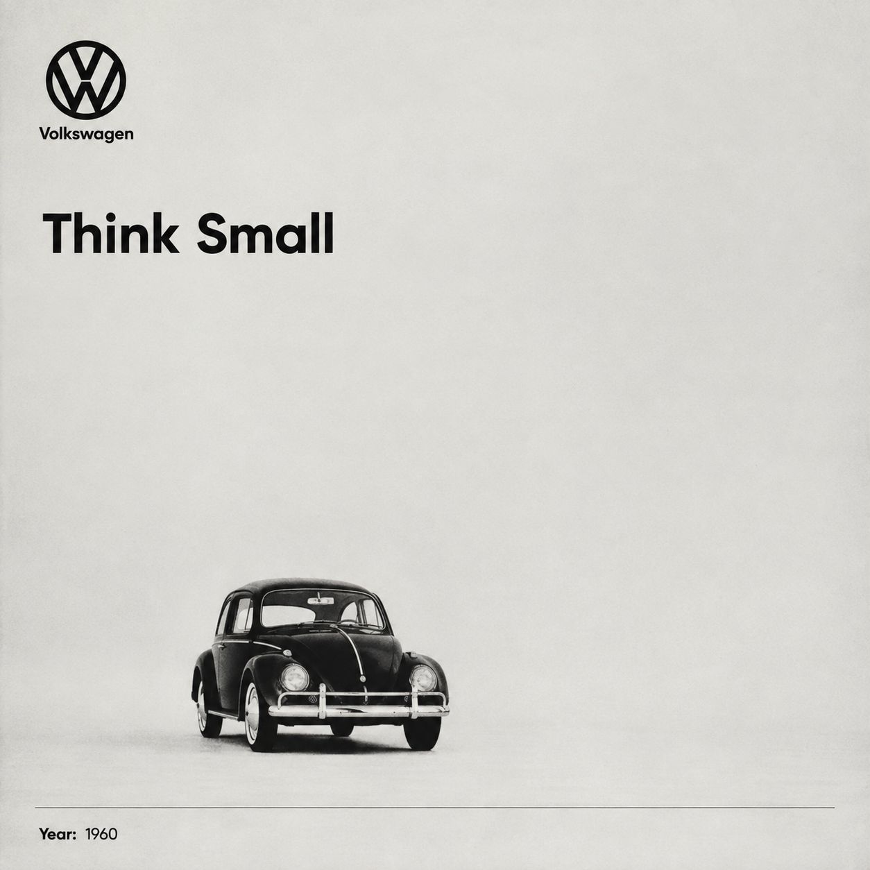
Doyle Dane Bernbach’s 1959 campaign broke every rule of car advertising at the time. A tiny car photographed small in a sea of white space, paired with a self-deprecating headline, turned the Beetle’s size from a weakness into its whole personality.
2. Absolut Vodka — “Absolut [Blank]”
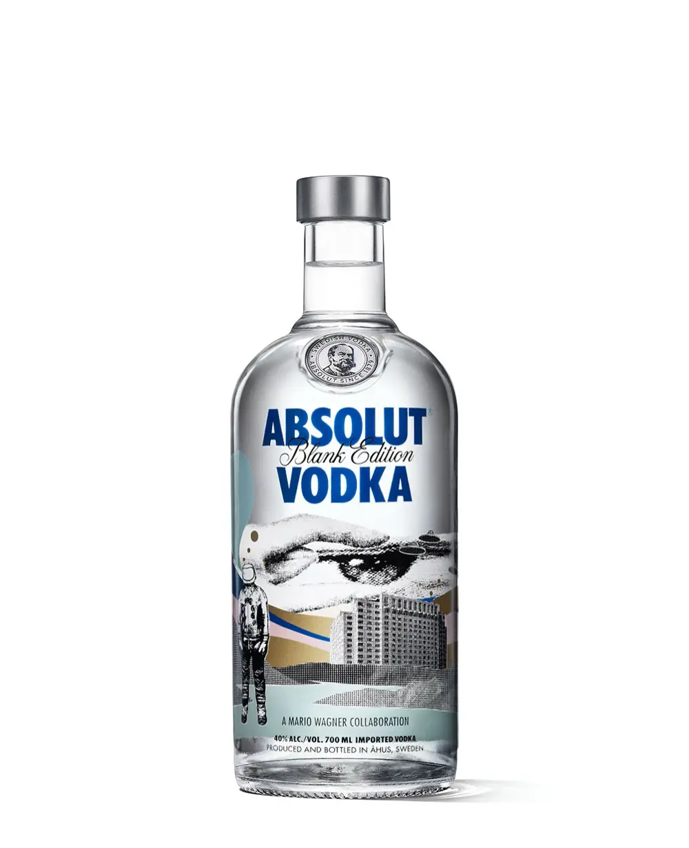
Running for more than two decades, this campaign turned the shape of a vodka bottle into a visual-pun machine—Absolut Perfection, Absolut Warhol, Absolut LA—becoming one of the most imitated print formats in advertising history.
3. Got Milk? — Celebrity Mustache Series
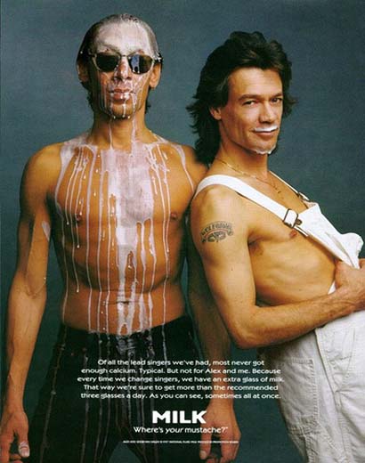
A simple white milk mustache on a celebrity’s face, paired with the two-word headline, made an everyday product culturally relevant for years.
4. Nike — “Just Do It” Launch Ads
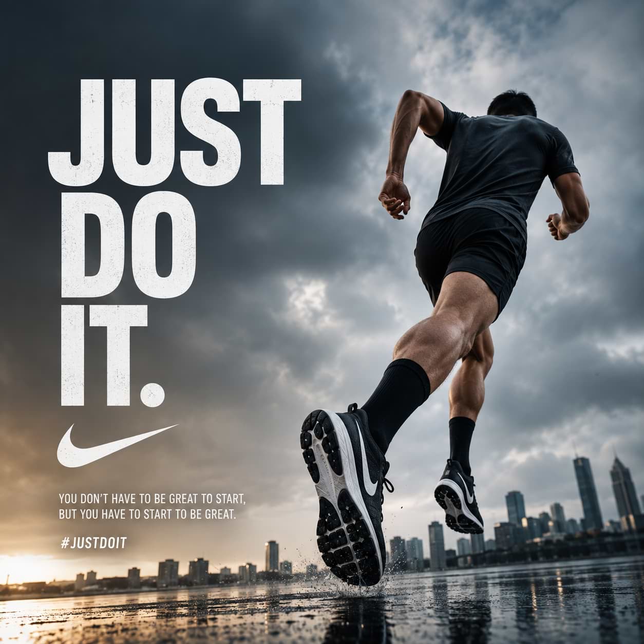
Nike’s early print work paired stark black-and-white athlete photography with minimal copy, proving that confidence in imagery could replace lengthy sales pitches entirely.
5. Marlboro — The Marlboro Man
Whatever one thinks of the product, the rebrand from a “feminine” filtered cigarette to a rugged cowboy image remains one of the most studied repositioning campaigns in print history.
6. Guinness — “Good Things Come to Those Who Wait”
The famous surfer execution, an offshoot of the television spot, distilled patience and craft into a single dramatic wave image.
7. Chanel No. 5 — Minimalist Bottle Shots
Decades of Chanel print advertising relied on little more than a clean product shot and elegant typography, proving that restraint can be as powerful as spectacle.
8. The Economist — “I Never Read The Economist”
A management trainee, aged 42, admits he never reads The Economist—a single line of red-on-white copy that became part of one of the longest-running print campaigns in advertising.
9. Apple — “Think Different”
Portraits of history’s great disruptors, with almost no product in sight, sold a worldview rather than a device.
10. De Beers — “A Diamond Is Forever”
This iconic tagline and its accompanying imagery are credited with helping cement the diamond engagement ring as a cultural default.
11. Coca-Cola — “It’s the Real Thing”
Decades of consistent red-and-white print work built one of the most recognizable visual identities in advertising.
12. Levi’s 501 — “The Quality Never Goes Out of Style”
Bartle Bogle Hegarty’s stripped-back product photography helped make denim a fashion statement rather than simply workwear.
13. Nike Air — “It’s Gotta Be the Shoes”
Tight product photography combined with playful copy to turn a shoe into a talking point.
14. IBM — “Think”
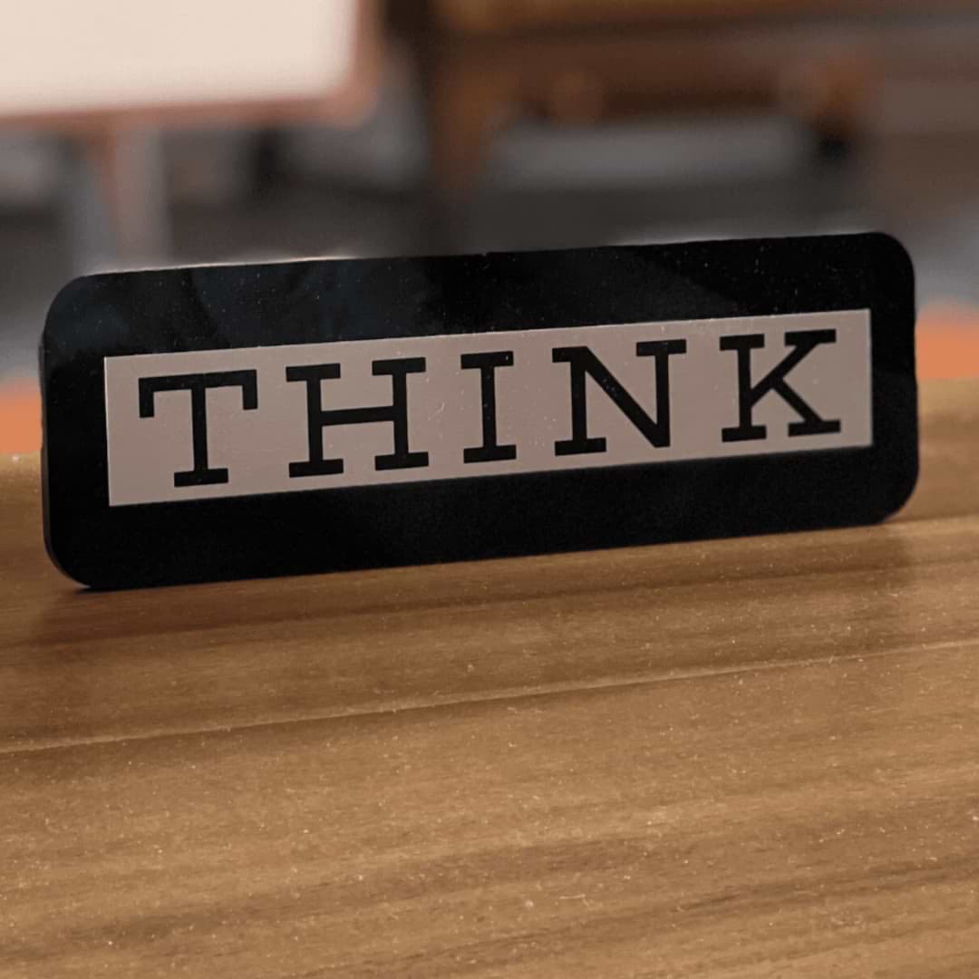
One word, repeated across decades of corporate print advertising, built an entire brand philosophy.
15. Avis — “We Try Harder”
Admitting to being the number-two rental-car company, rather than hiding it, remains a masterclass in honest positioning.
Funny Print Ads
Nothing earns attention faster than a genuine laugh. These are examples of funny print ads where the humor does the heavy lifting.
16. KFC — “FCK” Apology Ad
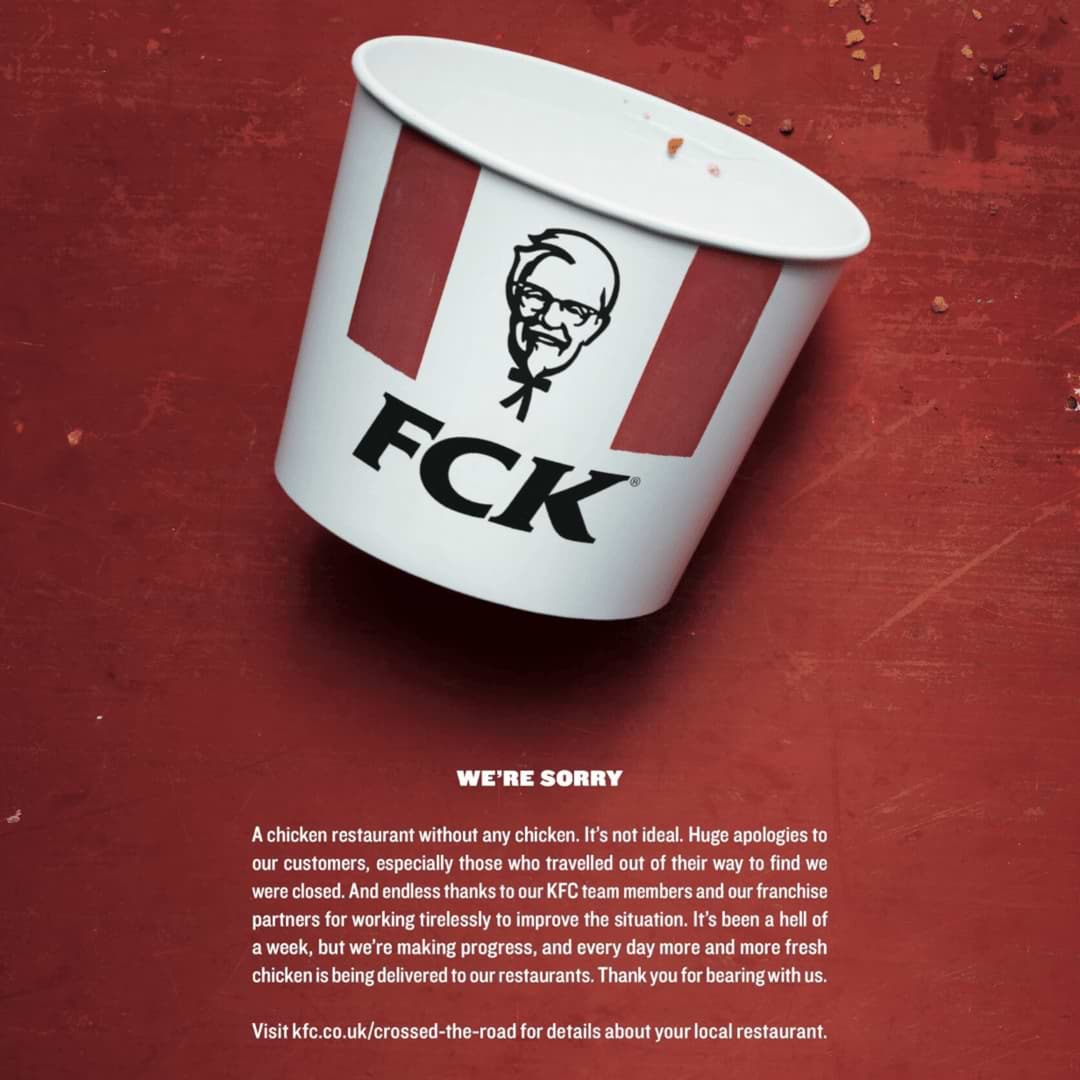
When KFC ran out of chicken in the UK in 2018, it rearranged its own bucket logo to spell “FCK” and issued a witty apology. It became a benchmark for handling a brand crisis with self-aware humor.
17. IKEA — “Designed for Apples”
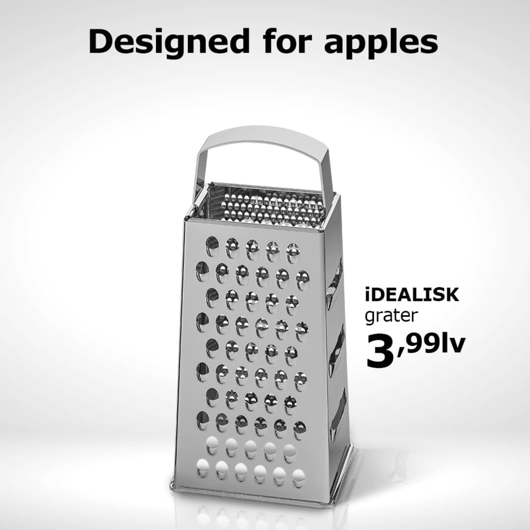
A cheese grater styled to resemble Apple’s product design pokes fun at Apple’s aesthetic while quietly showing off IKEA’s own design credentials.
18. Marmite — “Don’t Forget It”
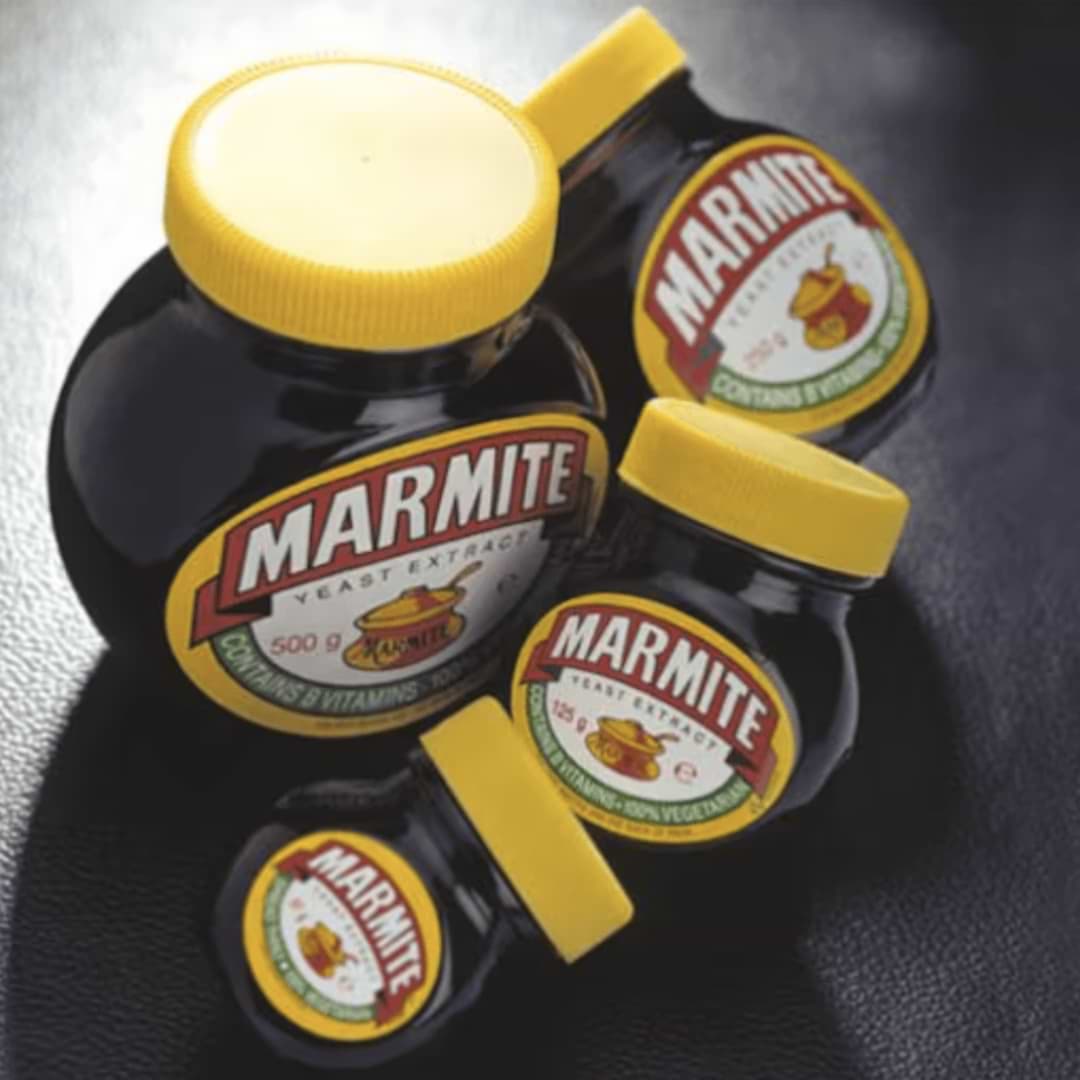
A neglected, dusty jar pushed to the back of the cupboard makes light of the brand’s famously divisive taste, turning a weakness into a running joke.
19. WMF Knives — Sliced Animals
A double-page spread shows animals seemingly sliced cleanly in half, proving the knife’s sharpness through a dark but comedic visual gag.
20. Orbit Gum — “Dirty Mouth”
A cartoon character shown in various food-related embarrassments makes the case for chewing gum feel more urgent—and much funnier.
21. Ekopen Mosquito Repellent — “Good Night”
Simple typography splits “zzz” from mosquito “bzzz” with a single line, delivering the punchline through layout alone.
22. PNET — “Moss-Covered Employee”
An employee so bored at his job that moss has started growing on him provides a visual joke that instantly communicates career stagnation.
23. Band-Aid — Hulk’s Hand
A giant bandage stretched across the Hulk’s massive hand implies that the product survived an angry transformation without snapping—an absurd and memorable visual joke.
24. Sta-Soft / Softlan — Tough Guys as Soft Fabric
Famous tough-guy actors rendered as soft-cloth caricatures make the “softens even the toughest” message land as a visual punchline.
25. Listermint — The Departing Congregation
A pastor mid-sermon watches his congregation flee, implying that his breath is the real reason for the empty pews—dark humor for a mouthwash brand.
26. Heinz — “So Hot It Smoulders”
Fries visibly scorched by the ketchup’s heat exaggerate a simple product claim into a comic visual.
27. Fiat — “Fear the Squirrel”
A driver terrified of a tiny squirrel outside the city pokes fun at how disconnected urban life can make people from nature.
28. Lazer Bike Helmets — Full Body Cast
A man in a full-body cast, still wearing his helmet, delivers dark comedy while making a powerful safety argument.
29. Jeep — Giraffe/Penguin Illusion
An optical-illusion print ad flips from a giraffe to a penguin depending on its orientation, rewarding the reader with a second look.
30. Tzomet Sfarim — “Face a Book”
A cheeky tweak to a familiar technology logo encourages readers to put down their phones and pick up an actual book.
Creative Print Ads
This section focuses on genuinely out-of-the-box thinking—the creative print ad work built around clever layouts, illusions, physical interactions, and unexpected materials.
31. Coca-Cola — Hands Forming the Bottle
Two hands of different skin tones create the negative space of an iconic bottle silhouette, delivering an inclusivity message without a single word.
32. Barilla — Spaghetti Fireworks
An overhead shot of spaghetti arranged like a fireworks burst turns pasta into a New Year’s celebration.
33. Nivea — Crescent Moon Jar
A partially opened cream jar photographed against a dark background becomes a crescent moon—a clever use of the product as imagery.
34. Faber-Castell — “The Scream” in Pencils
Edvard Munch’s famous painting is recreated entirely from the brand’s colored pencils, showcasing the range in a single glance.
35. DHL — The Page-Flip Ad
A magazine spread uses the physical act of turning the page to demonstrate how quickly DHL can move a parcel from one place to another.
36. FedEx — World Map Apartment Windows
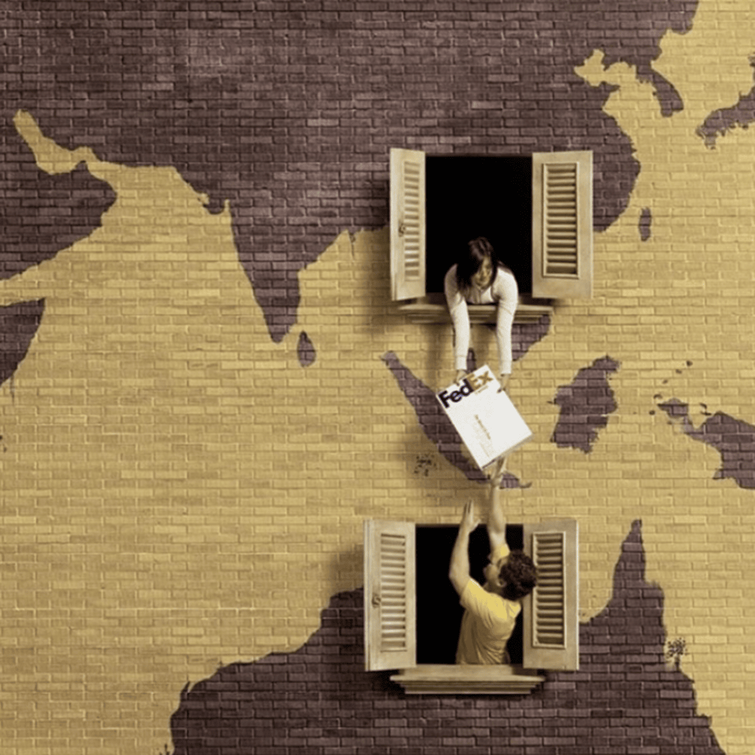
Neighbors passing a parcel window-to-window across a stylized map layout illustrate international delivery as something almost effortless.
37. Penguin Books — Author Headphones
Illustrations of Shakespeare, Twain, and Wilde are shaped into headphones, suggesting that the authors are “speaking” directly into the reader’s ear for an audiobook range.
38. Van Gogh Museum Café — Broken Ear Cup
A coffee cup with a chipped handle subtly references Van Gogh’s famous ear story.
39. Capacitate — The Florist Pin
A map-pin icon is reimagined as a florist’s shop awning, turning a generic location marker into a visual metaphor for visibility.
40. Pilot Pens — The Dinner Plate Message
A parent’s note written in waterproof ink at the bottom of a child’s plate is revealed only after the food is finished, simultaneously rewarding good behavior and demonstrating ink durability.
41. Gett Delivery — Little Red Riding Hood
A familiar fairy tale is reframed to show that with fast delivery, there’s no need for a long journey through the woods.
42. WWF — Shark Fin Rear-View Mirror
A rear-view mirror reflecting a shark fin, followed by an empty ocean, delivers an environmental warning through two contrasting images.
43. Whiskas — Cat Chasing Antelope
A house cat is shown chasing an antelope like a wild cheetah, tapping into the instinctual side of a common pet.
44. Gold’s Gym — Transforming “FAT to FIT” Typeface
Letters in the word FAT are gradually replaced by increasingly fit body silhouettes until they spell FIT—a simple type-based transformation story.
45. ASICS — City Under Your Shoe
A city map printed onto the sole of a running shoe suggests that the wearer can cover the entire city in comfort.
46. McDonald’s — XL Coffee Stains
Coffee-ring stains positioned only at the corners of an open magazine spread visually demonstrate just how large the “XL” cup is.
47. KRAFT Cheese — The Broken Mousetrap
A mangled, defeated mousetrap implies that the mouse escaped with ease—thanks, presumably, to strength gained from calcium-rich cheese.
48. Orion Telescopes — “Made in China”
A telescope supposedly powerful enough to read the “Made in China” label on a flag planted on the moon takes a product claim to a witty extreme.
49. Colgate Floss — The Strawberry Smile
A close-up of strawberry seeds stuck between teeth is playfully unpleasant, making the case for flossing self-evident.
50. Sanzer Hand Gel — Grimy Payphone
Dirty fingertips seen through the numbers of an old public payphone make a hygiene case through pure visual disgust.
Car Advertisement Print Ads
The automobile category has produced some of the most technically ambitious print work in advertising. Here are standout examples of car advertisement print creativity.
51. Volkswagen — Porcupine Between Goldfish Bags
A porcupine parked with pinpoint precision between two fragile bags of goldfish demonstrates a parking-assist feature far more memorably than a specification sheet could.
52. Volkswagen Touareg — The Shaved Mountain Goat
A mountain goat’s back is shaved into a poodle-style trim, blending off-road capability with luxury grooming in a single sharp visual.
53. BMW M3 — The Flash’s Hand on the Wheel
A superhero known purely for speed is shown gripping the steering wheel, linking the car’s performance to an instantly recognizable icon.
54. Honda Motorcycles — Maze Traffic
A tangled maze of gridlocked cars contrasts with a motorbike’s ability to weave straight through, visualized as literal maze-solving.
55. Ford — Rear-View Camera Selfie Dog
A dog staring directly into a rear camera evokes the warmth and immediacy of the feature with an emotionally engaging, almost accidental “selfie.”
56. Opel — Blurry Texting Type
Deliberately garbled, hard-to-read typography mimics what a text message looks like when typed while driving, connecting poor typing directly to road danger.
57. Fiat Panda Cross — Fear of a Squirrel
A city-dweller intimidated by nature reinforces both the humor and the car’s “get outdoors” positioning.
58. Mercedes-Benz — Crash-Test Silhouette Series
Long-running print work built around safety engineering used minimal graphics to demonstrate crumple zones and structural integrity without requiring photography.
59. Audi — “Vorsprung durch Technik”
Decades of clean, engineering-focused print ads relied on precise product photography and a single German tagline to build a reputation for technical superiority.
60. Jeep — Giraffe/Penguin Optical Print
An optical-illusion execution implying that the driver decides what they see on the road reinforces Jeep’s adventurous positioning.
Best Print Ads 2026
Print is far from dead. Brands continue to find fresh, award-worthy ways to use the medium.
61. IKEA — Sustainability-Themed Furniture Illusion Series
Recent IKEA print work has leaned into circular-economy messaging, using flat-pack furniture silhouettes that double as environmental icons such as trees, leaves, and water drops.
62. Duolingo — The Owl’s “Streak Anxiety” Series
Duolingo’s cheeky, slightly unhinged owl mascot carries its playful brand voice into print with tongue-in-cheek reminders about daily streaks.
63. Oatly — Deadpan Copy-Heavy Ads
Oatly’s continued use of long, self-deprecating, conversational copy stands out in an increasingly minimalist print landscape.
64. Spotify Wrapped — Data-as-Headline Print Series
Turning anonymized, funny listening-habit statistics into bold, single-line headlines keeps this format fresh year after year.
65. Liquid Death — Absurdist Horror-Comedy Print
Liquid Death’s over-the-top “murder your thirst” aesthetic continues to stand out through deliberately absurd, heavy-metal-inspired imagery for a canned-water brand.
66. Heinz — AI-Generated Ketchup Art Campaign
A widely discussed campaign showed AI image generators repeatedly producing ketchup bottles resembling Heinz. The brand printed the results as evidence of its visual recognizability.
67. Dove — Real Bodies, Real Skin Continuation
Dove’s long-running Real Beauty positioning continues into new print work rejecting retouching and keeping the campaign relevant into its third decade.
68. Nike — Motion-Blur Athlete Series
Recent Nike print work returns to raw, high-contrast athlete photography with minimal typography, echoing its earliest “Just Do It” era.
69. Airbnb — “Live There” Local-Detail Print
Print ads highlighting hyper-local details of real host homes continue Airbnb’s effort to differentiate itself from conventional hotel advertising.
70. Patagonia — “Don’t Buy This Jacket” Legacy Continuation
Patagonia’s anti-consumerism messaging, encouraging customers to repair rather than replace, remains a rare example of advertising that explicitly argues against buying more.
Food & Beverage Print Ads
71. Pepsi — Halloween Coca-Cola Cape
A Pepsi can wears a Coca-Cola-branded cape, playing on the two brands’ famous rivalry for a seasonal Halloween moment.
72. Hellmann’s — Santa’s Beard Spoon
A dollop of mayonnaise on a spoon is styled to resemble Santa’s white beard, tying a condiment to the Christmas dinner table.
73. Burger King — “Flame-Grilled” Real Fire Photos
Actual photographs of small kitchen fires at Burger King locations are reframed as proof of the brand’s flame-grilling heritage.
74. McDonald’s — Dracula Fries
Two fries positioned as fangs and dipped in ketchup “blood” turn a side dish into a Halloween mascot.
75. Seitenbacher Cereal — Dream Anxiety Series
A cereal brand illustrates anxious dreams involving clowns, dentists, and deadlines, connecting hunger with poor sleep in an unusual but memorable way.
76. Coca-Cola — Holiday Truck Print Series
The instantly recognizable red delivery truck, illuminated for the holidays, has anchored decades of Coca-Cola seasonal advertising.
77. Guinness — “Good Things Come” Surfer Print
Foam-capped waves double as a metaphor for the beer’s iconic head, connecting patience and craft to the pour itself.
78. Nutella — Breakfast Spread Typography Series
Print work built around handwritten-style type mimicking a spoon “writing” in spread keeps Nutella advertising playful and homemade.
79. Absolut Vodka — City Skyline Bottle Series
Major city skylines are reshaped into the bottle’s silhouette, extending the brand’s long-running visual-pun format internationally.
80. KFC — Finger-Lickin’ Phone Button
A phone’s home button, worn down like a well-licked finger, plays on KFC’s signature tagline in an unusually cheeky way.
Tech & Gadget Print Ads
81. Bose — The Silent Mime Series
Noise-cancelling headphones are compared to watching a mime—all the visual chaos, none of the noise.
82. Apple MacBook — Ultra-Thin Newspaper Print
A MacBook is arranged to resemble a folded newspaper page, emphasizing its slim profile through the print medium itself.
83. JBL — Rival World Leaders Bickering
Two feuding public figures argue loudly in the background while a listener enjoys total silence through noise-cancelling headphones.
84. iPod Shuffle — Central Park Earphone Map
Earphone cables are laid out to trace a running route through Central Park, connecting the product to motivation and movement.
85. Sony — Ultra-Vivid Color Bleed Series
Long-running television and camera print ads used oversaturated colors bleeding beyond the page to demonstrate picture quality.
86. Kodak — “Kodak Moment” Family Album Print
Decades of warm, nostalgic family photography helped cement “Kodak moment” as a phrase in everyday language.
87. HP — Print-in-Seconds Speed Series
Simple before-and-after page reveals demonstrated printer speed without needing extensive copy.
88. Samsung — Split-Screen Multitasking Print
A single page divided cleanly in two demonstrated a phone’s multitasking capability through strong graphic layout.
89. Nikon — The Photographer’s Eye Series
Print ads shaped like camera viewfinders invited readers to “look through the lens” themselves, turning the reader into the photographer.
90. Orion Telescopes — Moon Flag Close-Up
An image supposedly sharp enough to resolve tiny text from the lunar surface demonstrates the telescope’s precision claim.
Dental Print Ads
Oral care brands have long relied on print advertising to make everyday hygiene habits feel urgent, aspirational, or simply memorable — often through humor or exaggerated visual metaphors.
91. Sensodyne — “Sensitivity Relief” Close-Up Series
Extreme close-up photography of ice cream, hot coffee, and cold drinks paired with a wincing expression communicated tooth sensitivity pain instantly, without needing a single word of explanation.
92. Oral-B — Electric Toothbrush “2X Cleaning” Comparison Print
Side-by-side plaque-removal visuals, often shown under blacklight-style contrast, gave Oral-B’s clinical claims a simple, visual proof point that outperformed a typical spec-sheet approach.
93. Aquafresh — Triple Protection Stripe Visual
The brand’s distinctive red-white-and-blue striped toothpaste became the entire print campaign’s visual hook, translating “three benefits in one” into an instantly recognizable design element.
94. Listerine — “Bad Breath Confession” Series
A recurring print format showing awkward social moments — a close conversation, a job interview, a first date — used discomfort humor to make the case for mouthwash without ever mentioning it directly until the final panel.
95. Colgate — “32 White Teeth Always Smiling” Vintage Print Series
Decades of Colgate’s cheerful, wide-smile print advertising built one of oral care’s most recognizable brand promises, tying the product directly to confidence and social approval.
Popular Print Ads
96. WWF — Endangered Species Silhouette Series
Minimalist black silhouettes of endangered animals fading into empty space deliver a stark, wordless conservation message.
97. Plant for the Planet — Leaf as Lung
A single green leaf styled to resemble a human lung ties reforestation directly to human breath and survival.
98. French Ministry of Health — Child Obesity Awareness
A stark visual pairing junk food with childhood-obesity statistics was designed to make parents reconsider children’s eating habits.
99. StrongerMarriage.org — “ME to WE”
A single letter swap—turning M into W—visually reframes the idea of partnership in marriage.
100. Ecovia — Stop the Violence Road Safety Series
Hard-hitting imagery ties drink-driving and distracted driving directly to real consequences, aiming to shock readers into caution.
101. McCann Health — Organ Donation Awareness
A quietly emotional visual metaphor encourages organ-donor registration without relying on graphic imagery.
102. Pedigree — Adopt a Dog Comparison
A split visual contrasts life without a pet against life with a dog, making the emotional case for adoption in one glance.
103. Amnesty International — Silenced Voices Series
Long-running print work uses stark typographic treatments—partially blacked-out or restrained text—to represent censorship and human-rights abuses.
104. UNICEF — Childhood Interrupted Series
Simple before-and-after imagery highlights how conflict and poverty can cut childhood short.
105. Movember — The Half-Grown Mustache Print
A simple half-finished mustache visual, tied to men’s-health awareness, turns a lighthearted grooming trend into a serious health conversation starter.
Magazine Print Ads
Fashion and beauty brands have long treated the print page as a runway. These are some of the category’s most talked-about print advertisements.
106. Benetton — “United Colors of Benetton”
Oliviero Toscani’s decades-long print work for Benetton used bold, often controversial real-world photography—covering race, war, disease, and other social issues—to push the brand’s diversity message far beyond conventional fashion advertising.
107. Diesel — “Be Stupid”
Diesel’s cheeky global campaign celebrated risk-taking and rule-breaking over caution, using bold red-and-white typography and provocative imagery aimed at a young, rebellious audience.
108. Wonderbra — “Hello Boys”
A single billboard-turned-print image and a three-word headline became one of the most talked-about and parodied ads of the 1990s, built almost entirely around confident simplicity.
109. Calvin Klein — “Obsession” Fragrance Series
Stark black-and-white photography and a single-word brand name turned Calvin Klein’s fragrance print work into a study in restraint and sensuality rather than hard selling.
110. L’Oréal — “Because You’re Worth It”
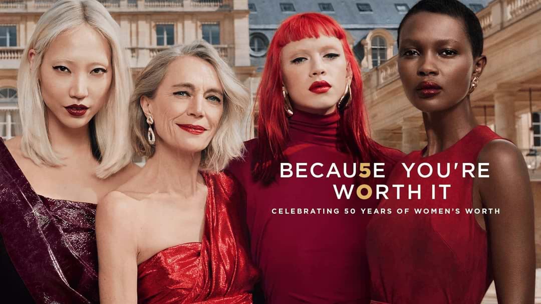
One of the longest-running beauty taglines in advertising history has anchored L’Oréal’s print work since the 1970s, connecting a simple confidence message to generations of product launches.
111. CoverGirl — “Easy, Breezy, Beautiful”

Bright, clean beauty photography paired with an upbeat three-word rhythm made this tagline instantly repeatable across decades of print advertising.
112. Dove — “Real Beauty” Original Campaign
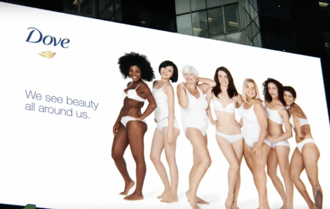
Dove’s landmark early-2000s campaign replaced professional models with real women of varied ages, shapes, and skin tones, directly challenging conventional beauty imagery.
113. Chanel No. 5 — Marilyn Monroe Era Print
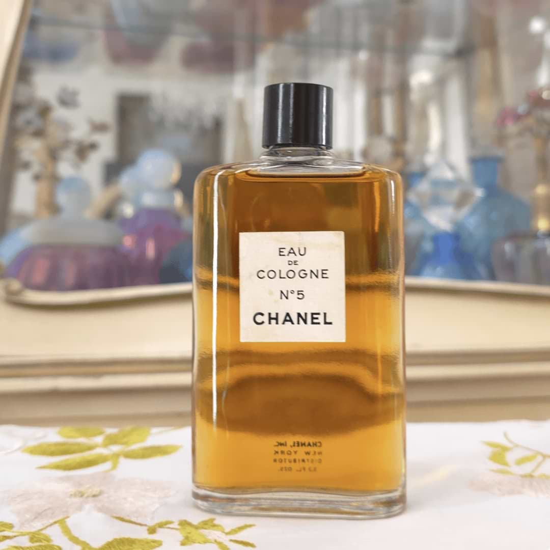
Print work built around the idea that a woman “wears nothing else” relied on mystique and suggestion rather than a conventional product-focused execution.
114. Axe (Lynx) — “The Axe Effect”
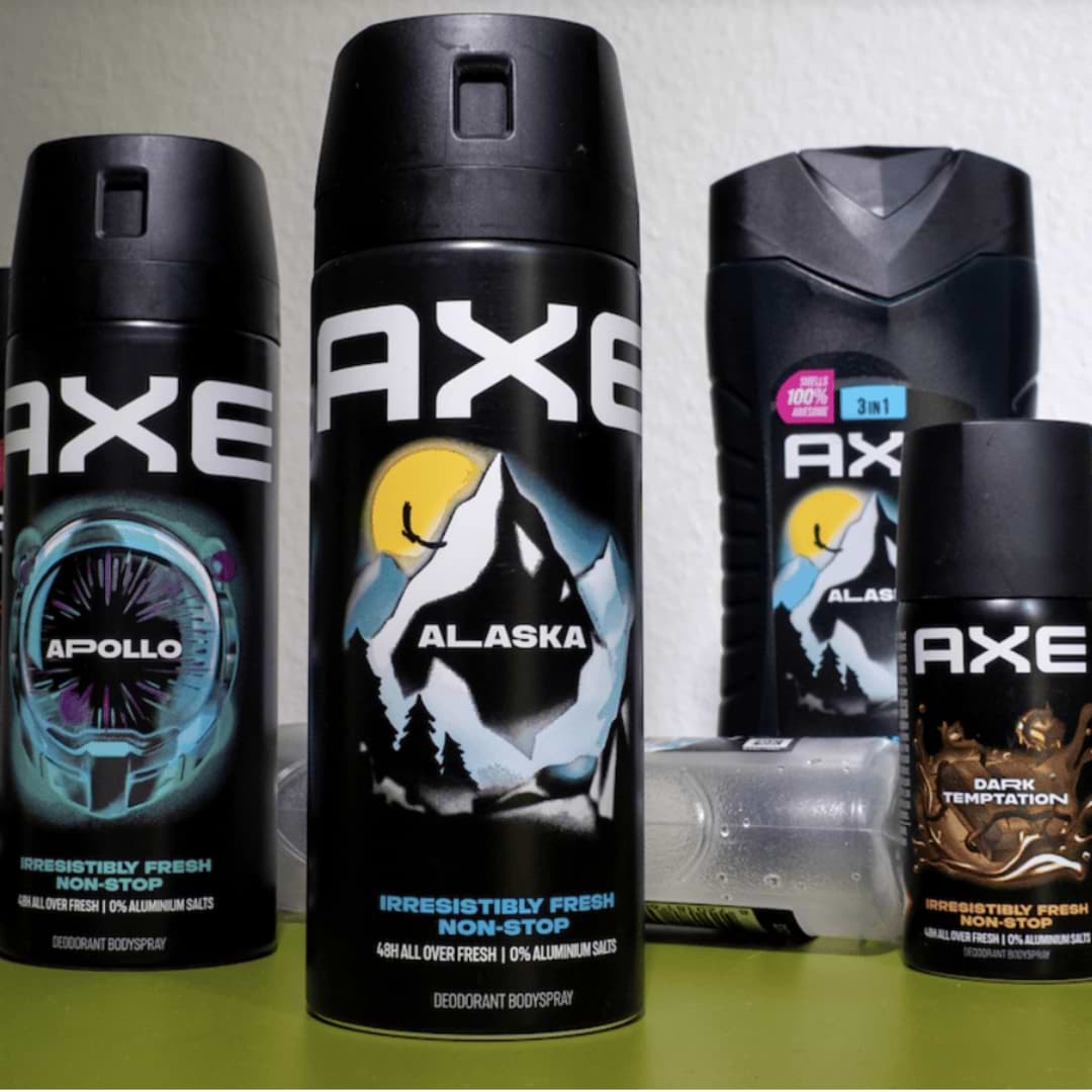
Exaggerated, comedic scenarios showing ordinary men becoming irresistible after using the product made this one of the most recognizable young men’s grooming campaigns in print.
115. Missoni for Target — Pattern-First Print Series
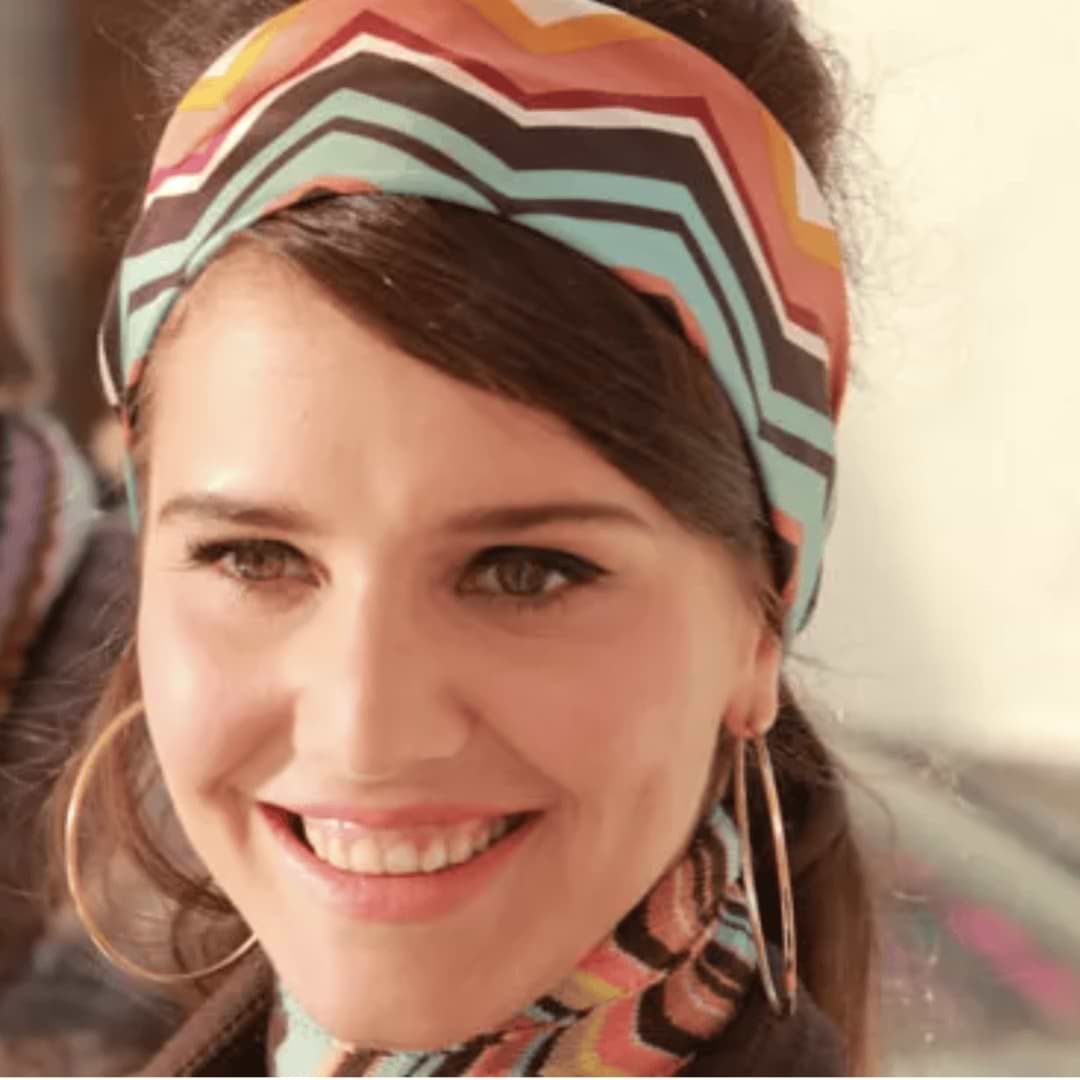
The high-fashion Italian house’s signature zigzag knitwear patterns were used to fill entire print pages, treating the layout itself as a runway for a mass-market retail collaboration.
Frequently Asked Questions (FAQs)
1. What is a print ad?
A print ad is a paid advertisement designed for physical printed media, such as newspapers, magazines, billboards, brochures, or posters. Unlike digital ads, print ads rely entirely on a single static visual and headline to communicate a message, since there’s no video, sound, or interactivity involved.
2. Are print ads still effective?
Yes, print ads remain effective in specific contexts, particularly for building brand credibility, reaching niche or older demographics, and creating a tactile, less disruptive reading experience compared to digital ads. Many brands also use print for award-season creative work and portfolio pieces, since a strong print concept often influences broader campaign strategy.
3. What are some good print advertisement examples for students?
Classic print advertisement examples that are frequently studied by design and marketing students include Volkswagen’s “Think Small,” Absolut Vodka’s bottle-shape series, and The Economist’s “I Never Read The Economist” campaign, since each demonstrates a single, clear idea executed with strong visual or copywriting discipline — useful lessons for building a student portfolio.
4. What makes a print ad effective?
An effective print ad typically communicates one clear idea instantly, without relying on lengthy copy. The strongest examples pair a striking visual with a short, memorable headline, using layout, illusion, or clever product placement to make the message stick in a single glance.
5. What is the difference between a print ad and a digital ad?
A print ad is a static, physical advertisement placed in media like magazines or newspapers, while a digital ad appears on websites, apps, or social media and can include video, animation, and interactive elements. Print ads generally have a longer creative shelf life and higher perceived credibility, while digital ads offer more precise targeting and measurable performance data.
6. Where can students find free print ad examples for coursework or portfolios?
Beyond classic case studies like the ones in this list, students can browse award archives from organizations like the Cannes Lions, D&AD, and The One Show, as well as creative showcase sites like Ads of the World, which host thousands of real print campaigns with agency and brand credits for reference and study.